


conceptualizing CSS units
Here, we’ll delve into CSS units of measurement and their parsing. Understanding this topic can help us identify, predict and control which property takes what value in the end, and visualize how CSS components work and fit together, which is a crucial skill for frontend developers.
Before diving in, it is recommended that you have a grasp of the basics of how CSS is parsed. If you’re unfamiliar with the topic, feel free to check out my previous article.
If you’re already familiar, you may find the flowchart below helpful as a refresher.
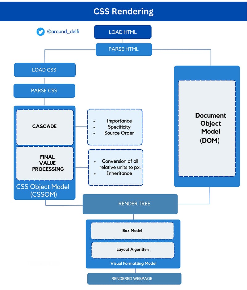
Flowchart: CSS Rendering
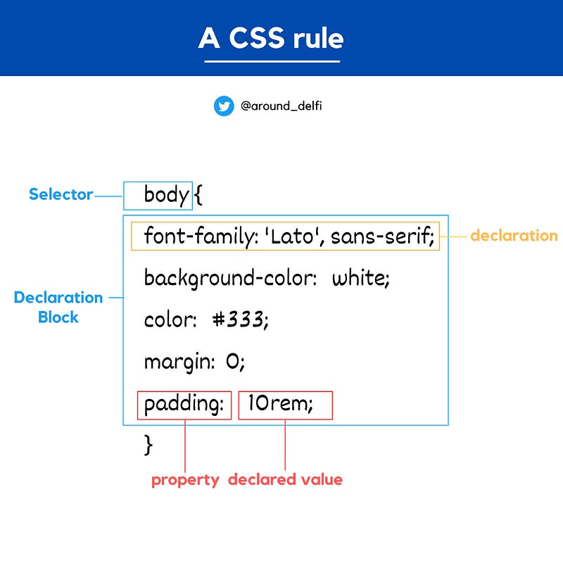
So let’s start with the basics: A CSS rule
A CSS rule has the following parts:
1. Selector: The selector specifies the HTML element or elements that the rule will apply to. It can be a tag name, a class, an ID, or a combination of these.
2. Declaration block: It is wrapped within curly braces where we have the declaration block, which contains one or more declarations separated by semicolons. Each declaration consists of a CSS property and its corresponding declared value, separated by a colon. For example:
Anatomy of a CSS rule
Unit in CSS
In CSS, units are used to specify the size or distance of an element. They can be broadly categorized into Absolute units and relative units.
Absolute units are the units that represent fixed sizes that are independent of the document’s layout.
For example, a 20px font size will always appear the same size on any screen, regardless of the screen size or resolution.
Relative units, on the other hand, are relative to some other value, such as the font size of an element or the width of the screen. These include em, rem, percentage (%), and viewport units (vw, vh, vmin, vmax).
For example, a font size of 1em is equivalent to the font size of the parent element.
Unit Processing
Whenever we use a unit other than a px, it will ultimately be converted into px during the value processing in CSS parsing phase. Here we are going to discuss how it happens to return a final rendered website.
Let us consider the following block of CSS code as a go-along example:
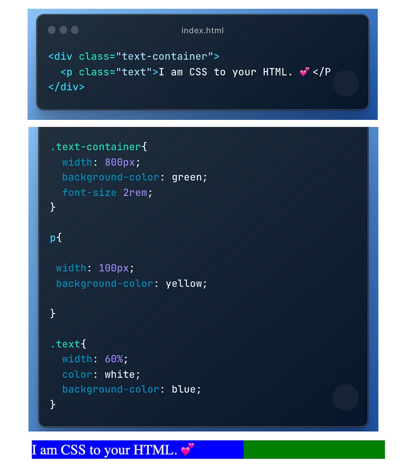
Sophisticated Example
- Declared value (declared by the author)
It is the value that is explicitly set for a property on an element in the CSS code using a property-value pair.
In case of conflicting declarations, the final declared value is resolved through the cascade which gives cascaded value.
For example,font-size:2remin.text-container - Cascaded Value (after the cascade)
The value of a conflicting property that is determined by the CSS cascade process, which considers the priority given to different CSS rules that apply to the same element is called cascaded value.
In the above example,.textandphas conflicting width declaration, however, the width is set to60%because the class selector is more specific than the element selector.
Can you see why the background is blue?
Note: For some properties for example font size, if there is no declared value user-agent(browser) sets its cascaded value by default which is usually 16px. - Specified Value (defaulting if there is no cascaded value)
It is the value that is explicitly set in the CSS code, or it’s inherited from the parent element, or it’s the initial value defined in the CSS specification depending upon the following case:
How Specific value is calculated in CSS
Case I:
If a specific value is set for the property in the stylesheet, that value is used as the specified value for the element.
In our example, the width property is set to 60% for the paragraph then 60% is the specified value for that property.
Case II: If the property is inherited, and there is no specific value set for the element in the stylesheet, then the value is inherited from the parent element.
In our example, the font-sizeand colorproperty value is inherited to p element from its parents.
One of the most important things to remember in CSS is Every property must have a value even if the author, user, or user-agent (browser) doesn’t specify it.. but wait we don’t explicitly mention the value of each and every property right? How does CSS resolve it?
Inheritance
Inheritance is the process of propagating the property value from the parent element to their children. In CSS, if you set a value for a property on a parent element, that value will be automatically applied to all child elements unless they have their own value specified.
The following are some important points to remember about inheritance in CSS:
- Not all properties are inherited.
For example, properties related to fonts are inherited. - The computed Value (Now what’s this? We’re getting there next.) of the parent gets inherited.
- Child elements can override inherited values with their own values.
- We can use inherit keyword to force inheritance and the initial keyword to reset the property to its initial value.
Case III: If there is no specific value set for the property in the stylesheet, and it’s not an inherited property, then the initial value (specific to each property) defined in the CSS specification is used.
For example, the initial value for the font-weight property is “normal” unless you explicitly set it to “bold” in our stylesheet.
Initial value
Do you remember, In CSS, every element on a webpage has CSS properties with values, even if they are not explicitly declared?
These values are set to an initial value if no other value is declared and if there is no inheritance. The initial value is the default value specified in the CSS specification and is used when no cascaded value exists. It varies between CSS properties and is specific to each property.
For properties such as margin and padding being set to 0. (which makes sense, right?).
4. Computed Value (converting the relative value to absolute)The computed value is calculated by converting the relative value to absolute so that it can be inherited. CSS keywords like red, auto, and bold are computed and replaced in this step.
5. Used Value (final calculation based on layout)
The Used Value is the final value calculated based on the layout of the page. The CSS engine uses the rendered layout to determine the remaining values that depend on it and converts them into pixels during the rendering phase.
For example, the width of a paragraph is set to 60% of its parent’s width. The browser needs to calculate the parent’s computed width before determining the element’s actual width in pixels. The used value for the width will be 60% * 800 = 480 px.
How CSS engine converts the relative unit to absolute (px)?
The exact process of converting a relative unit to pixels depends on the specific unit being used but occurs during the phase of calculating computed value and used value and generally follows the following steps:
- Determine the base value: The base value is the value that the relative unit is based on.
For example, if the relative unit is em, the base value is the font size of the element. - Convert the relative unit to pixels: The relative unit is then converted to pixels based on the base value. For example, if the base value is the font size of the element and the relative unit is em, the em value is multiplied by the font size to get the final pixel value.
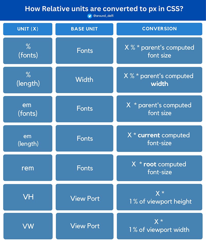
Relative units to pixel conversion chart.
6. Absolute Value
After the used value is calculated, the absolute value is determined by rounding the value to the nearest whole pixel. This is necessary because browsers can only display whole pixels on the screen, and rounding ensures that the element is rendered sharply and clearly.
For example, if the computed value is 143.8 pixels, the absolute value would be 144 pixels. This rounded value is the final value used in the layout and is restricted by the browser and device.
To tie it up, understanding how CSS units are processed is an important aspect of web development. Units in CSS can be absolute or relative, and they are used to specify the size or distance of an element. During the parsing phase, CSS units are ultimately converted into pixels, and a value for each property is resolved through the cascade and inheritance processes. It is also essential to remember that every property must have a value, even if it is not explicitly declared, and that each CSS property has an initial value that is used when no other value exists.
By grasping these concepts, front-end developers can better control and visualize how CSS components work and fit together, ultimately leading to more efficient and effective web development.
If you’re looking to master the CSS units, please be on the lookout for my next article where I’ll be explaining CSS units and the conversion chart above in detail.
Here’s the link to MDN docs if you are curious to learn more:
https://developer.mozilla.org/en-US/docs/Web/CSS.